
Hello Friends,
Welcome to the very first edition of Meng Design ✨
If you grabbed one of my freebies on Lemon Squeezy or subscribed to my old publication (Growth in Tech), you’ll now find everything here, together under one roof.
This new newsletter is where I’ll share:
🎨 Design tips & tutorials (with starter files + video walkthroughs)
🌱 Personal growth notes from my own creative journey
I can’t promise it’ll land in your inbox every single week, but I can promise it’ll always be worth your time.
Alright — let’s dive into this week’s design tip!
LEARN DESIGN
Effortlessly create gradient shapes
In this Figma tutorial, I’ll show you how to create stunning gradient shapes using simple gradients, Photopea blur effects, and distortion techniques for modern, fluid visuals. Perfect for adding depth and style to your interfaces—beginner-friendly!

Video Tutorial is linked below.
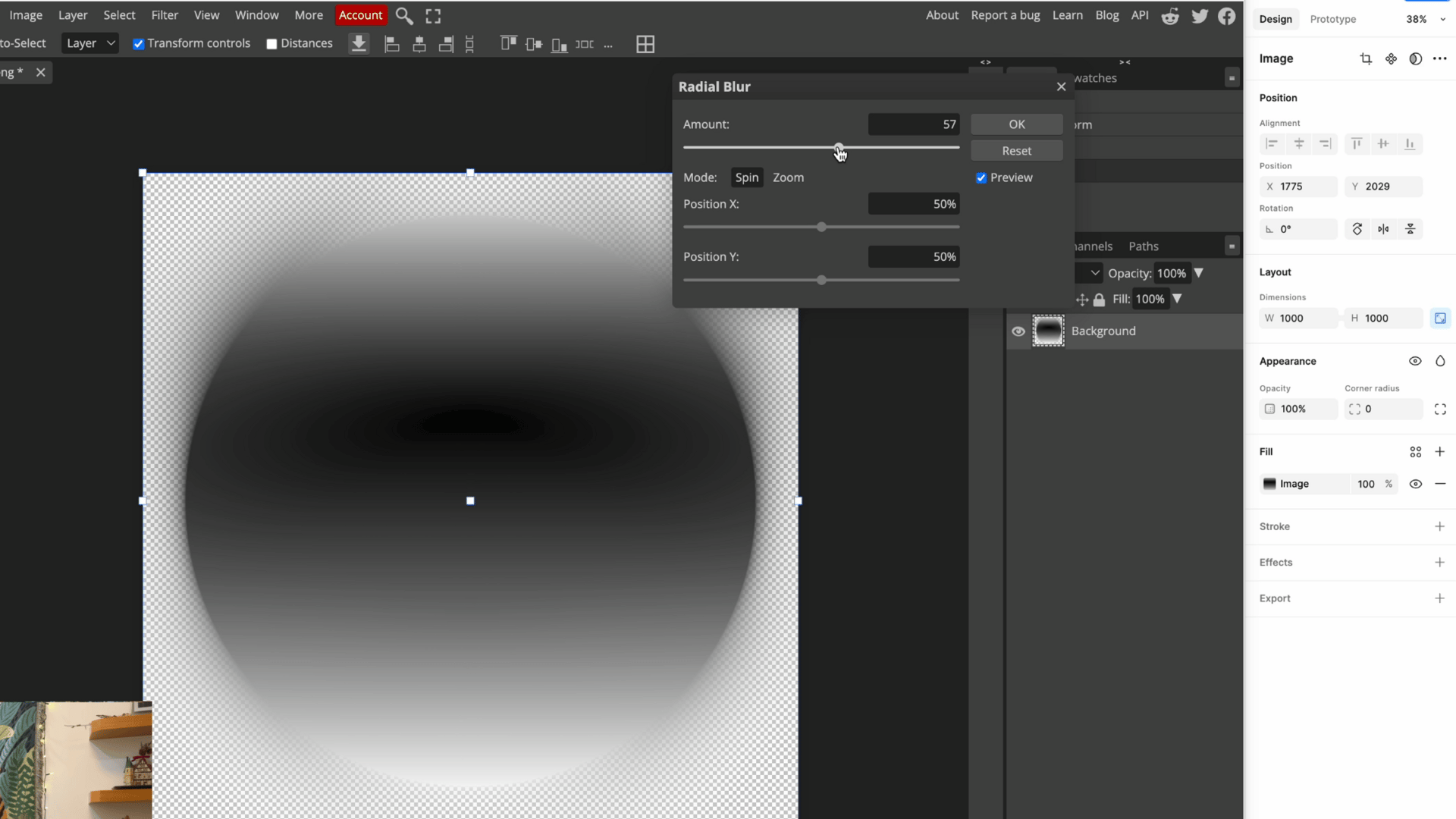
Step 1 - Base Shape
Start with a basic 1000x1000 square with a black-to-white gradient. Nothing fancy yet, but this is your foundation.
⭐ Pro tip: Keep your frame at least 1000px to maintain sharp image quality throughout the process.
1️⃣ First ingredient: Shape. Try any shapes with neutral gradient.

Step 2 – Add the Blur Magic
Here's where the magic happens:
Copy as PNG, so it become an image →
Drop into Photopea plugin →
Apply radial blur (go for 50-80 value) →
Apply it Twice.
Watch those edges soften and everything start to glow. 🌟
2️⃣ Second ingredient: Blur (Radial blur is a must, but you can pair it with other kind of blur)
Want to skip ahead? 🎁 Grab the starter file
Step 3 – Distort for Drama
Time to get creative with distortion.
1. Use Free Transform (unlink width/height for free stretching) →
Then Edit → Transform → Warp.
🎭 Want more drama? Try Filter → Distort → Shear and play with those curve points.
3️⃣ Third ingredient: Distortion(Any kind of transformation counts.)

Step 4 – Bring in Color
Back in Figma, use gradient mapper to add your colors. This is the secret sauce that brings everything to life.
🦔 Spot any harsh edges? Add progressive blur in effects panel.

∞ This technique is endlessly remixable.
Try different base shapes, blur amounts, and distortion styles to develop your own signature look.

RECENT LEARNING
Celebrating Small Wins
This week, I'd like to share something that really helped me get through a tough time: keeping track of small wins.
For about a month now, I've been writing down my progress, even when it feels trivial. It started when I agreed to give a university lecture on app design. As someone who works in solitude, I needed to practice my voice, so I began doing vocal warm-ups.
My first recorded "win" was unexpected: "My singing got better after voice exercises."
I've always struggled with high notes, even on "Happy Birthday." But after some vocal practice, I could sing a Benson Boone song! ( Not with his power, obviously, but good enough to entertain myself. )
It's quite surprising how this small wins lifted my energy. When we're a little bit lost, it's really easy to stay unnoticed of those small progress we made.
So now, I start each day by singing a song 🎤. It reminds me that every bit of progress is worth celebrating.
I encourage you to try this too. What small win could you document today? Maybe you figured out that tricky animation, or a client loved your color choice, or you learned a new Figma technique😏?
Thanks for reading!
If the design tips saved you time or gave you an idea, share this email to a friend who’d love it too. They can join here for free!
New here? Subscribe to get next week’s design shortcut
P.S. Got a design problem you’d like me to cover? Just hit reply — I read every message.